Benjamin Moore neutrals
Share
Choosing the right neutral for your walls can be a daunting task with so many shades to consider. However, some Benjamin Moore neutrals have become designer favourites because of their versatility, warmth, and ability to complement various styles. These timeless shades will simplify your choices, offering the perfect backdrop for any interior. Here’s a list of designer-backed Benjamin Moore neutrals that can make your life — and your decision-making — a whole lot easier.
1. Revere Pewter (HC-172)
- Why Designers Love It: As one of the most popular neutrals in the Benjamin Moore range, Revere Pewter strikes the perfect balance between grey and beige. It has a soft, warm tone that makes any space feel welcoming without being too bold or overpowering.
- Best For: Living rooms, dining rooms, and kitchens. It’s the ideal neutral for open-plan spaces, blending well with both light and dark furniture and a variety of accent colours. Revere Pewter works well with white trim, natural wood, and even bolder tones like navy or charcoal.
- Pro Tip: Use Revere Pewter in spaces where you want to create a sophisticated yet inviting atmosphere. It’s excellent in spaces with lots of natural light as it will bring warmth to the room.
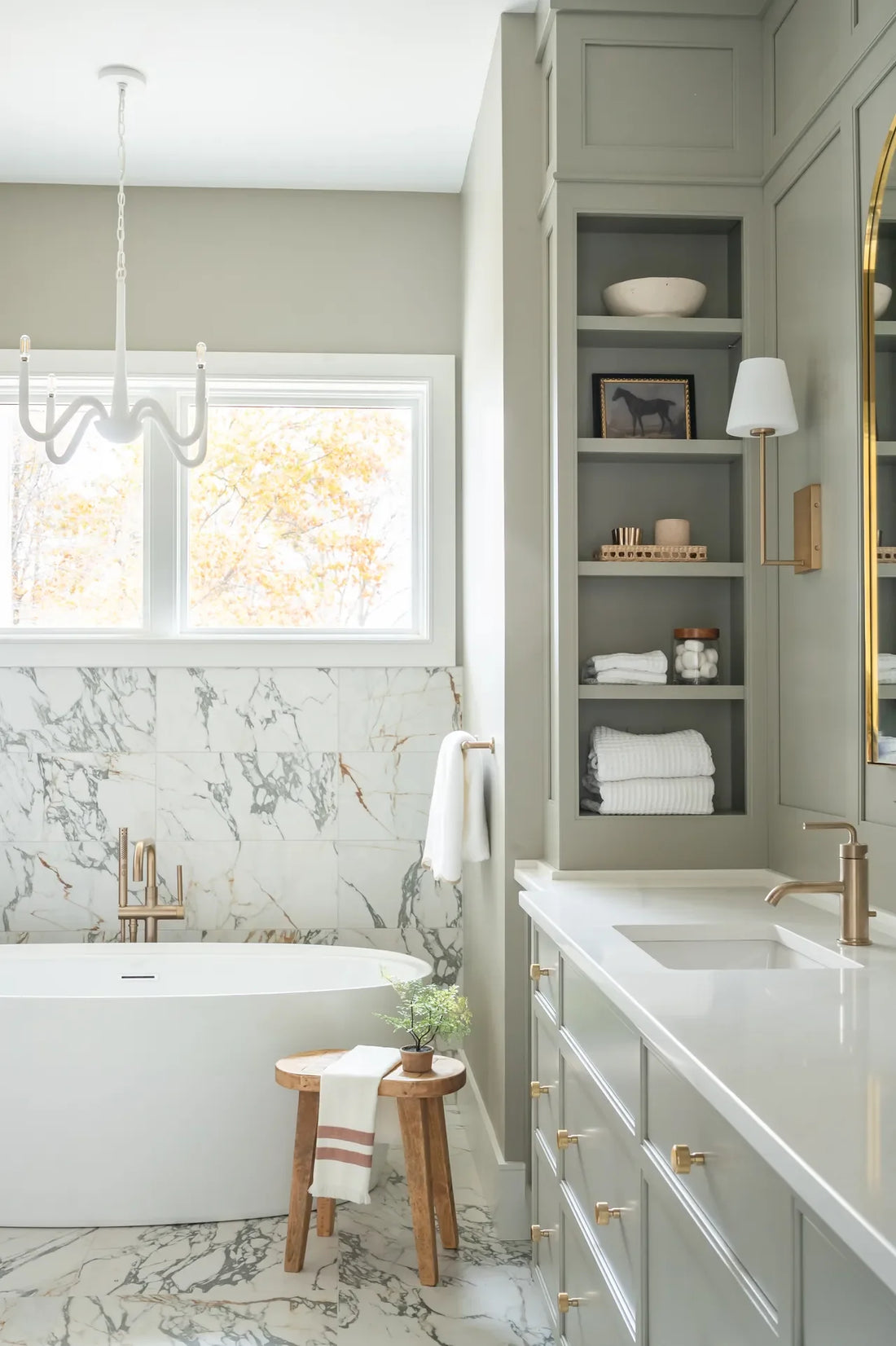
2. Balboa Mist (OC-27)
- Why Designers Love It: This pale, warm grey with beige undertones is incredibly versatile and works across a wide range of design styles. It’s perfect for those who want a neutral that’s not too cold but still modern.
- Best For: Hallways, bedrooms, and bathrooms. Balboa Mist is often used in spaces where a soft, serene feel is desired, such as relaxing bedrooms or chic, airy bathrooms.
- Pro Tip: Pair it with soft accent colours like muted pastels, or go for a more dramatic contrast with deeper tones like forest green or charcoal.
3. Edgecomb Gray (HC-173)
- Why Designers Love It: A soft, warm grey that reads almost as a taupe, Edgecomb Gray is a true designer favourite. Its understated tone makes it a perfect neutral for modern, traditional, and even rustic interiors.
- Best For: Living rooms, dining areas, and offices. It adds warmth without feeling too heavy or yellow-toned, making it ideal for spaces where you want a light yet cosy feel.
- Pro Tip: Combine it with crisp white trim and rich wood accents, or pair it with deeper, contrasting tones like navy blue or dark green for a more contemporary look.
4. Gray Owl (OC-52)
- Why Designers Love It: This light grey with blue undertones is fresh and airy, making it a go-to for modern interiors. Gray Owl is bright and neutral enough to work in virtually any room, while still providing subtle depth.
- Best For: Kitchens, bathrooms, and open-plan living spaces. Its cool undertones make it an excellent choice for spaces where you want to add a touch of calm and clarity.
- Pro Tip: Pair it with white or navy accents for a crisp, clean look. It also works beautifully with natural stone and wood finishes.
5. Classic Gray (OC-23)
- Why Designers Love It: As the name suggests, Classic Gray is a timeless light grey that is soft but not too faint. It has the ideal balance of warmth and coolness, making it a perfect neutral that complements any design style.
- Best For: Small rooms, hallways, or areas with low light. Classic Gray can make a room feel airy and open, while still providing a sophisticated base for bolder design elements.
- Pro Tip: This shade works well with a variety of accent colours. Try pairing it with deep blues or greens for contrast, or keep it light and airy with soft whites and pale pastels.
6. Pale Oak (OC-20)
- Why Designers Love It: Pale Oak is a warm, light beige-grey that can read almost like a soft taupe. It's light enough to brighten a room but offers enough depth to feel substantial.
- Best For: Living rooms, bedrooms, and open-plan spaces. It creates a relaxed, neutral backdrop that doesn’t overwhelm a room.
- Pro Tip: Combine with both white and warm wood tones to create a balanced and inviting environment. It’s particularly stunning in rooms with a lot of natural light, as it reflects light beautifully.
7. Shaker Gray (HC-167)
- Why Designers Love It: This medium grey with blue-green undertones offers a sophisticated, muted tone that gives a space depth without feeling too dark. It’s a great option for those who want a bit more colour in their neutrals but still need something subtle.
- Best For: Dining rooms, accent walls, or even entryways. Shaker Gray adds a sense of calm sophistication, particularly when paired with wooden furniture or metallic accents like brass or gold.
- Pro Tip: Use this on one accent wall to create a dramatic focal point, or use it throughout a smaller room to add depth and interest.
8. Muslin (1088)
- Why Designers Love It: Muslin is a warm, soft taupe with a beige base. It’s a go-to for designers who need a neutral that’s not too grey but still offers a sophisticated, muted tone.
- Best For: Bedrooms, living rooms, and family rooms. Its warmth makes it perfect for creating a cosy, inviting atmosphere, and it pairs wonderfully with wood, stone, or metal accents.
- Pro Tip: Pair it with muted jewel tones (like deep greens or purples) or rich leather furniture for a cosy, stylish look.
9. Sea Haze (2137-50)
- Why Designers Love It: A soft grey-green, Sea Haze brings a refreshing, natural vibe to any space. It’s light and airy with just enough colour to make a subtle statement.
- Best For: Bathrooms, bedrooms, or coastal-inspired living rooms. Its calming nature makes it perfect for spaces meant for relaxation.
- Pro Tip: Pair it with crisp white for a fresh, clean look, or add gold accents for a bit of glamour. It also works well with natural materials like linen or wicker.
10. Sterling (1475)
- Why Designers Love It: This taupe-grey offers a sophisticated and slightly cool tone that works well in both modern and traditional settings. It’s subtle yet striking, offering a neutral backdrop with just enough personality.
- Best For: Dining rooms, home offices, or accent walls. Its balance of warmth and coolness makes it perfect for adding a bit of elegance to a space without overwhelming it.
- Pro Tip: Pair with deep blues, greys, or even a rich, bold colour like burgundy for a more dramatic look. It also works well with polished metals or natural stone.
Conclusion
These Benjamin Moore neutrals are designer-backed for a reason — they’re timeless, versatile, and offer a perfect backdrop for various interior design styles. Whether you're after a soft, calming tone or a rich, deep hue, these shades will make your wall-painting process easier and your space more sophisticated. The key is to choose a shade that complements your existing décor and fits with the overall mood you want to create. With these go-to neutrals, you can’t go wrong