Best-selling Benjamin Moore neutrals
Share
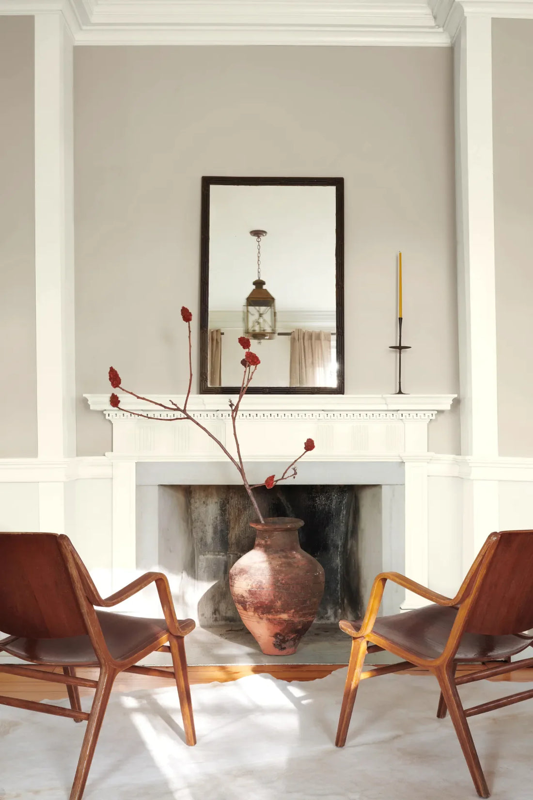
When it comes to creating timeless, versatile spaces, Benjamin Moore neutrals are a designer favourite. These shades can serve as the perfect backdrop for various styles, from contemporary to traditional, and they pair effortlessly with both bold and subdued accent colours. Below is a list of some of the best-selling Benjamin Moore neutrals, which are consistently chosen by homeowners and designers alike for their flexibility, warmth, and sophisticated undertones.
1. Revere Pewter (HC-172)
- Why It’s a Best-Seller: Revere Pewter is a warm, light grey with beige undertones, making it one of the most popular neutrals in the Benjamin Moore range. It's subtle yet rich, making it incredibly versatile in various interior design settings.
- Best For: Living rooms, kitchens, and open-concept spaces. It complements both modern and traditional furniture, and its soft warmth works with a wide range of colour schemes.
- Pro Tip: Combine with white trim for a fresh, clean look, or pair with deeper tones like navy or charcoal for added contrast.
2. Balboa Mist (OC-27)
- Why It’s a Best-Seller: This light, warm grey with beige undertones is adored for its ability to reflect light and create a calm, serene environment. It’s subtle enough to work in almost any room, yet provides just the right amount of warmth.
- Best For: Bedrooms, bathrooms, and hallways. It’s ideal for creating soft, soothing spaces and works beautifully in both traditional and contemporary interiors.
- Pro Tip: Pair with natural wood tones and soft pastels for a relaxed, airy feel, or with darker colours for a more sophisticated vibe.
3. Edgecomb Gray (HC-173)
- Why It’s a Best-Seller: A light, warm grey that reads almost like a taupe, Edgecomb Gray is a versatile neutral that adds warmth without feeling too dark. It’s a fantastic all-around choice for any room.
- Best For: Living rooms, dining areas, and bedrooms. Its soft, balanced tone works well in larger spaces or rooms with lots of natural light.
- Pro Tip: Pair with crisp white trim for a fresh contrast, or combine it with rich colours like teal, mustard, or dark green for a more dynamic look.
4. Gray Owl (OC-52)
- Why It’s a Best-Seller: Gray Owl is a cool, soft grey with a subtle hint of blue that creates a fresh and airy vibe. It’s perfect for contemporary spaces, offering just the right amount of depth without overpowering the room.
- Best For: Kitchens, bathrooms, and open-plan living spaces. Its cool undertones make it a good choice for spaces that need lightness without being too stark or sterile.
- Pro Tip: Pair it with whites and metallics for a modern, sleek look, or introduce pops of colour with deep greens or blues for a more vibrant space.
5. Classic Gray (OC-23)
- Why It’s a Best-Seller: A warm, light grey that works well with both cool and warm colours, Classic Gray is a timeless choice that has just enough depth to be more than a traditional off-white. It's especially popular for those seeking a subtle, modern backdrop.
- Best For: Small rooms, corridors, and offices. Its light tone helps to make spaces feel larger, while still maintaining a sophisticated feel.
- Pro Tip: Pair with darker accent furniture or rich colours like emerald green or navy for added contrast.
6. Pale Oak (OC-20)
- Why It’s a Best-Seller: Pale Oak is a soft, warm beige-grey that provides a serene and inviting atmosphere. It's one of those colours that works in almost any room and can adapt to various lighting conditions.
- Best For: Living rooms, bedrooms, and hallways. It’s particularly effective in creating a light, airy atmosphere while still adding some warmth.
- Pro Tip: Pair it with both white and wood accents to create a balanced, natural look, or use it alongside deep jewel tones for a more dramatic effect.
7. Shaker Gray (HC-167)
- Why It’s a Best-Seller: Shaker Gray is a soft, muted grey with blue-green undertones. It’s a bit richer and more saturated than some of the lighter greys, giving a room a sophisticated, classic vibe.
- Best For: Dining rooms, accent walls, and bedrooms. Its depth works particularly well in spaces where you want to add a bit of drama without going too dark.
- Pro Tip: Pair with white trim and natural wood accents for a beautiful balance, or with brass or gold elements for a luxurious touch.
8. Sea Haze (2137-50)
- Why It’s a Best-Seller: This soft, light grey with a subtle green undertone is a soothing, nature-inspired neutral. It’s perfect for creating a calming atmosphere in any room, particularly those designed for relaxation.
- Best For: Bedrooms, bathrooms, or living areas with a coastal or natural feel. It’s particularly effective in spaces where you want a refreshing, tranquil vibe.
- Pro Tip: Combine it with light wood, wicker, or natural stone for a harmonious, earthy look, or with crisp white for a clean, coastal aesthetic.
9. Sterling (1475)
- Why It’s a Best-Seller: Sterling is a cool, light taupe-grey that offers a sophisticated, understated look. It’s a bit darker than some of the other neutrals, which makes it perfect for those seeking a neutral with a bit more presence.
- Best For: Dining rooms, entryways, and home offices. It works well in spaces where you want to create a sense of elegance and refinement.
- Pro Tip: Pair with darker accent pieces, like deep blues or rich browns, or with polished metal finishes for a modern, luxurious feel.
10. Muslin (1088)
- Why It’s a Best-Seller: Muslin is a warm taupe-grey with a soft beige undertone, providing a sophisticated backdrop without being too bold. Its warmth makes it ideal for creating cosy, inviting spaces.
- Best For: Living rooms, bedrooms, and family rooms. It works particularly well in areas where you want a rich, inviting feel without the heaviness of darker tones.
- Pro Tip: Pair with soft textures like linen and velvet, or add metallic touches for a more luxurious feel.
Conclusion
These best-selling Benjamin Moore neutrals are beloved for their ability to create harmonious, timeless spaces. Whether you're looking to refresh a room, redecorate an entire home, or simply choose a subtle backdrop for accent pieces, these colours are guaranteed to work. They adapt beautifully to different lighting, decor styles, and preferences, making them perfect for almost any project