Farrow and Ball paint colours in real homes
Share
Farrow & Ball is a British paint brand synonymous with rich, beautifully crafted colours that evoke depth, character, and timeless elegance. Known for its luxurious finishes and an extensive palette of traditional and contemporary shades, Farrow & Ball has become a go-to for homeowners, designers, and architects looking to create spaces that feel both sophisticated and lived-in.
But what sets Farrow & Ball apart isn’t just the richness of their paint, but how these colours come to life in real homes. Whether it’s a period property full of heritage charm or a modern apartment looking for warmth and personality, Farrow & Ball’s paint tones are versatile enough to suit any style.
Let’s take a closer look at Farrow & Ball paint colours in real homes, showcasing how their famous hues are used to create unique and stunning interiors.
1. "Hague Blue" - A Bold, Statement Shade for Living Rooms
Why It Works: "Hague Blue" is one of Farrow & Ball’s most iconic and dramatic colours. This deep, rich blue is inspired by the Dutch city of The Hague and has an intensity that feels both historical and contemporary. It works wonders as a statement wall colour or for entire rooms, bringing a sense of drama and sophistication to spaces.
In Real Homes:
- Living Room: In a high-ceilinged period property, Hague Blue was used to paint the walls and trim of a living room, creating a cosy yet powerful space. Paired with warm wooden furniture, velvet cushions in jewel tones, and gold light fixtures, the deep blue gives the room a sense of timeless luxury.
- Complementary Tones: To balance the boldness of Hague Blue, a lighter shade like Strong White was used for the ceiling and trim. The contrast between the two shades makes the room feel grounded while allowing the blue to take centre stage.
Perfect for: Large living spaces, libraries, or statement walls.
2. "Shaded White" - Soft and Subtle for Bedrooms
Why It Works: Shaded White is a perfect blend of beige and grey, giving it a soft, muted tone with just enough warmth to avoid feeling cold. It’s subtle, serene, and perfect for creating a relaxing bedroom sanctuary.
In Real Homes:
- Bedroom: In a modern master bedroom, Shaded White was chosen for the walls to create a soft and calming environment. Paired with a sleek upholstered bed, minimalist furniture, and natural textures like linen and cotton, the room feels both restful and elegant.
- Complementary Tones: To add depth, the trim and cabinetry were painted in a slightly warmer shade like String, while soft touches of gold in the lighting fixtures provided a bit of glamour.
Perfect for: Bedrooms, living rooms, or any space where you want a serene, neutral backdrop.
3. "Ball Green" - Bringing Nature Indoors
Why It Works: Named after the green of the Ball Green ceramic tiles found in English country homes, this colour brings the outdoors inside. A soothing and organic green, it works beautifully in spaces that need a connection to nature or a fresh, calming palette.
In Real Homes:
- Kitchen: In a bright, airy kitchen, Ball Green was used on cabinets to give the space an earthy yet fresh look. Combined with sleek white countertops, marble backsplashes, and natural wood floors, it creates a balanced, welcoming environment.
- Complementary Tones: The warm, neutral tones of Ball Green were contrasted with All White on the walls, creating an easy-to-live-with but vibrant scheme. The greenery from plants in the room further enhances the natural vibe.
Perfect for: Kitchens, bathrooms, or spaces that want a fresh, nature-inspired vibe.
4. "Elephant’s Breath" - A Timeless Neutral for Open Plan Spaces
Why It Works: Elephant’s Breath is a soft taupe-grey that creates warmth without being overpowering. It’s one of Farrow & Ball’s best-loved neutrals because of its versatility—it's equally suited to modern interiors as it is to period homes.
In Real Homes:
- Open-Plan Living: In a contemporary open-plan living and dining area, Elephant’s Breath was used throughout the entire space. It’s neutral enough to let other design elements shine while providing a warm, inviting base. Large windows let natural light flood the space, bringing out the depth of the colour.
- Complementary Tones: The walls were paired with Farrow & Ball's "White Tie" for the trim and ceilings, which provided a soft contrast. The warm tones of the walls also worked beautifully with wooden floors and natural fabrics like linen and wool in the furniture.
Perfect for: Open-plan living areas, halls, corridors, or any space where you need a neutral that complements both contemporary and classic furnishings.
5. "Lime White" - Bright and Airy for Bathrooms and Hallways
Why It Works: Lime White is a soft, creamy white with a hint of warmth, making it a perfect choice for smaller rooms or spaces that need light and brightness, like hallways and bathrooms. It's far from stark, offering a soft, inviting glow.
In Real Homes:
- Bathroom: In a classic bathroom, Lime White was used on the walls, creating a light, airy feel that contrasts beautifully with traditional subway tiles and marble surfaces. The warmth of the white tones provides a softer, more inviting space compared to cooler whites.
- Complementary Tones: The soft warmth of Lime White was paired with Cinder Rose for accents around the mirror and fixtures, giving the bathroom a refined, sophisticated feel.
Perfect for: Small spaces like bathrooms, hallways, or any area where you want to maximise light and keep things feeling airy.
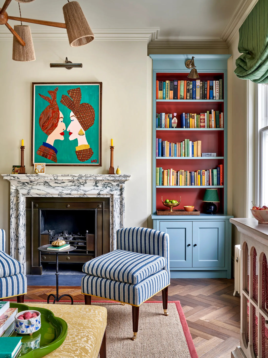
6. "Pavilion Grey" - A Cool and Calming Choice for the Home Office
Why It Works: Pavilion Grey is a cool grey with a hint of green, making it a perfect neutral for spaces that need a calm, focused atmosphere. This colour works particularly well in a home office or study, as it creates a soothing environment while still feeling professional.
In Real Homes:
- Home Office: In a home office with a mix of modern furniture and vintage finds, Pavilion Grey was used to paint the walls and bookshelves, providing a calm backdrop for work and relaxation. The cool tones create an atmosphere conducive to focus and concentration.
- Complementary Tones: The grey was complemented with deep greens and charcoal accents, giving the space an effortlessly stylish vibe. A sleek black desk and leather chair further elevated the modern, professional look.
Perfect for: Home offices, studies, libraries, or any space where you want a calm, productive atmosphere.
7. "Red Earth" - A Warm and Inviting Colour for Dining Rooms
Why It Works: Red Earth is a rich, earthy shade that feels both warm and inviting. This colour brings a sense of history and warmth to spaces, making it perfect for dining rooms or any area that’s meant for gathering and conversation.
In Real Homes:
- Dining Room: In a traditional home, Red Earth was used on the walls of a formal dining room, complemented by dark wood furniture and brass accents. The colour added richness and depth, creating an intimate setting perfect for hosting dinners.
- Complementary Tones: The walls were paired with white trim and deep green velvet curtains, striking a balance between warmth and elegance. The overall effect is cosy, sophisticated, and timeless.
Perfect for: Dining rooms, libraries, or anywhere you want to create a welcoming and luxurious atmosphere.
Final Thoughts: Why Farrow & Ball Paint Colours Work So Well in Real Homes
Farrow & Ball’s palette of paint colours isn’t just about aesthetics—it’s about creating a mood and enhancing the architecture and design of a space. Their paints, with their deep pigmentation and distinctive finishes, bring texture and depth to walls, creating spaces that feel comfortable, timeless, and well-curated.
From bold and dramatic blues like Hague Blue to soft, serene shades like Shaded White or Lime White, Farrow & Ball offers a versatile range that suits all kinds of homes, from country cottages to sleek city apartments. Whether you’re updating a single room or embarking on a complete overhaul, these colours—when used thoughtfully—can turn any home into a beautifully layered, lived-in space