How to Make Your Colour Pop: Use Neutrals as a Base for Colour to Pop by SJ Interior Designs
Share
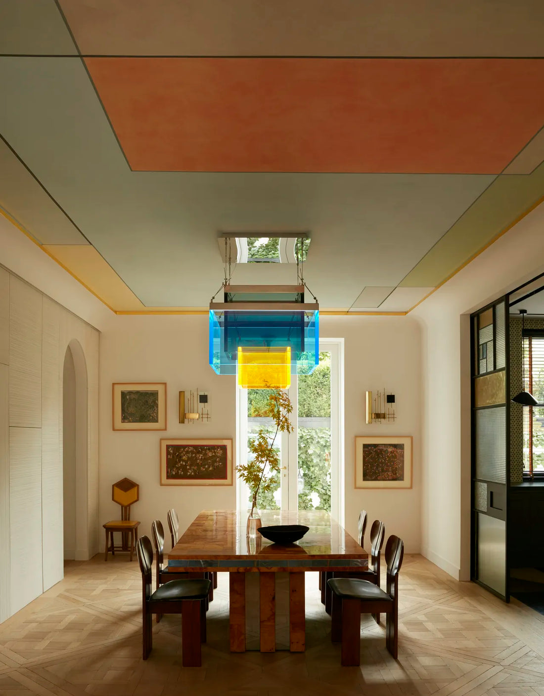
In the world of interior design, the right combination of colours can transform a space from ordinary to extraordinary. But how do you ensure that your bold, vibrant colours stand out without overwhelming the room? The answer lies in a design technique that's as effective as it is timeless: using neutrals as a base for colour to pop.
At SJ Interior Designs, we often use neutrals as a foundation for adding vibrant accent colours. Neutrals act as a backdrop that lets your colour choices truly shine, creating a sense of balance while allowing your bold hues to command attention in the right way. If you’re looking to create a space where your favourite colours pop, neutrals are your secret weapon.
In this blog, we'll explore why neutrals work so well as a base, how to pair them with bold colours, and how to achieve a cohesive and eye-catching interior. Ready to make your colours pop? Let’s dive in!
1. Neutrals Provide a Calm and Balanced Foundation
One of the most significant advantages of using neutrals is that they create a calm, balanced foundation for your space. Whether it’s on the walls, floors, or large furniture pieces, neutrals provide a backdrop that won’t compete with the brighter, bolder colours you choose to accentuate the room with.
-
Why It Works: When the main elements of the room—such as the walls, flooring, or larger furniture—are in neutral tones (like beige, grey, or white), they give the space a feeling of calm. This allows the accent colours to stand out without creating a chaotic or cluttered atmosphere. Neutrals don’t distract from bold tones but instead provide a perfect canvas for them to shine.
-
Tip: For walls and large furniture, opt for neutral shades like soft greys, whites, warm beiges, or light taupes. These create the ideal base for any colour palette you want to introduce into the room.
2. Neutrals Make Bold Colours More Dynamic
Bold colours—think jewel tones, bright blues, vibrant reds, or zesty yellows—can sometimes overwhelm a space if overused. But when paired with neutrals, they feel more dynamic and impactful.
-
Why It Works: Neutrals don’t compete with bold colours; they make them pop by contrast. For example, a bright orange throw pillow on a neutral beige sofa will instantly draw the eye and become the focal point of the room. Similarly, deep emerald green can look even richer when set against a neutral grey or cream backdrop.
-
Tip: To make bold colours stand out, use neutrals in your larger design elements (like walls, furniture, and rugs) and incorporate vivid accents in smaller decor pieces, such as throw pillows, vases, art, or lighting.
3. Neutrals Allow Flexibility with Accent Colours
One of the biggest benefits of using neutrals is that they work with any colour palette. Whether you want to add bold pops of colour today or switch it up with new hues in the future, neutrals give you the flexibility to change the colour scheme as needed.
-
Why It Works: Neutrals are timeless, so they never go out of style. When you want to refresh your room with a new trend or seasonal palette, all you need to do is swap out the accent pieces—without the hassle of repainting or reupholstering. This is especially handy for people who love to update their decor frequently.
-
Tip: Keep your walls, flooring, and main furniture neutral, and then use colourful accessories (like throw blankets, art, and cushions) to add seasonal pops of colour. This allows you to easily change your room’s look without needing a complete overhaul.
4. Neutral Tones Highlight the Texture and Pattern of Your Accents
Neutrals not only allow colours to pop, but they also highlight the texture and pattern of your decor. When you pair neutral tones with bold accent pieces, the details of those textures, patterns, and materials are more visible.
-
Why It Works: Whether it’s a rich velvet pillow, a patterned rug, or a sleek metal light fixture, neutrals provide the perfect stage to let these elements stand out. The more neutral your base, the more attention is drawn to the unique characteristics of your accent pieces, whether that’s texture, shape, or colour contrast.
-
Tip: Opt for neutrals with varying textures—like a matte grey wall with a glossy metal table or a soft beige sofa with a chunky knit throw pillow. The contrast between the textures and the bold colours will make your space feel inviting and layered.
5. Neutrals Help Control the Intensity of Bold Colours
Sometimes, bold colours can be overpowering. Using neutrals helps control the intensity of your accent colours, making them feel more harmonious rather than clashing with other elements in the room.
-
Why It Works: Neutrals help anchor the space, ensuring that bold accents don’t overwhelm the senses. For example, a deep navy accent wall can be complemented by soft white furniture, which allows the blue to feel dramatic but not too intense. Neutrals can soften the impact of a bold colour, making the room feel sophisticated and cohesive.
-
Tip: When using bold colours, balance them with neutral tones to maintain a sense of harmony in the room. For example, if you choose a bold colour for an accent wall, keep the furniture and accessories neutral to avoid creating a space that feels too heavy or visually jarring.
6. Create Focus with Pops of Colour
Using neutrals as a base allows you to create a clear focus in the room by drawing attention to specific design elements. With a neutral foundation, your accent pieces—whether they’re colourful furniture, artwork, or accessories—become the natural focal points of the space.
-
Why It Works: By limiting the use of bold colours to specific elements, you guide the viewer’s eye toward those focal points, creating a balanced and well-designed space. Neutrals allow the pop of colour to be even more striking because the surrounding space is calm and unobtrusive.
-
Tip: Use a neutral palette to create a clean background and then choose a vibrant color for statement pieces, such as a bold-coloured sofa, vibrant artwork, or bright pillows and throws. These elements will naturally draw attention without the room feeling too busy.
7. Neutrals Make Rooms Feel Bigger and Brighter
When paired with bold colours, neutrals can make a room feel larger and more open. Lighter neutrals, such as whites, beiges, or soft greys, reflect light and make small spaces feel airy and expansive. This allows vibrant accent colours to stand out without feeling cramped or overwhelming.
-
Why It Works: Light neutral colours reflect natural and artificial light, making the space feel more open and spacious. On the other hand, darker neutrals like charcoal or deep taupe provide a rich backdrop that makes lighter, brighter colours pop even more.
-
Tip: If you want to make a small space feel larger, opt for soft, light neutrals for the walls and large furniture pieces. Add pops of colour through artwork, textiles, and accessories to bring energy to the space without overcrowding it.
8. Use Neutrals to Define Your Colour Palette
Neutrals help define your overall colour palette and ensure that all of the colours you choose work together in a cohesive way. They act as a visual bridge between various accent colours and help to unify the design.
-
Why It Works: Without neutrals, multiple bold colours may clash or compete for attention. Neutrals serve as a grounding element, creating flow between colours and preventing a space from feeling disjointed.
-
Tip: Once you’ve chosen your bold accent colours, use neutrals to fill in the gaps. For example, if your accents are a combination of rich blues and greens, use neutrals like ivory, light grey, or warm taupe for your larger furniture pieces, ensuring everything blends seamlessly.
Final Thoughts: Make Your Colour Pop with Neutrals
The magic of using neutrals as a base is their ability to let your bold colours shine while maintaining balance and sophistication in your design. By creating a calming, neutral foundation, you ensure that your accent colours have the impact they deserve—without overwhelming the space. Whether you’re updating a room with colourful accessories, selecting statement furniture pieces, or painting an accent wall, neutrals provide the perfect backdrop for colour to pop.
At SJ Interior Designs, we love working with neutrals to craft spaces that feel both grounded and lively. If you’re ready to infuse your home with vibrant hues and timeless elegance, contact us today to start your design journey. Together, we’ll create a space where your colours truly pop!