Monochrome-on-monochrome aesthetics starving for personality
Share
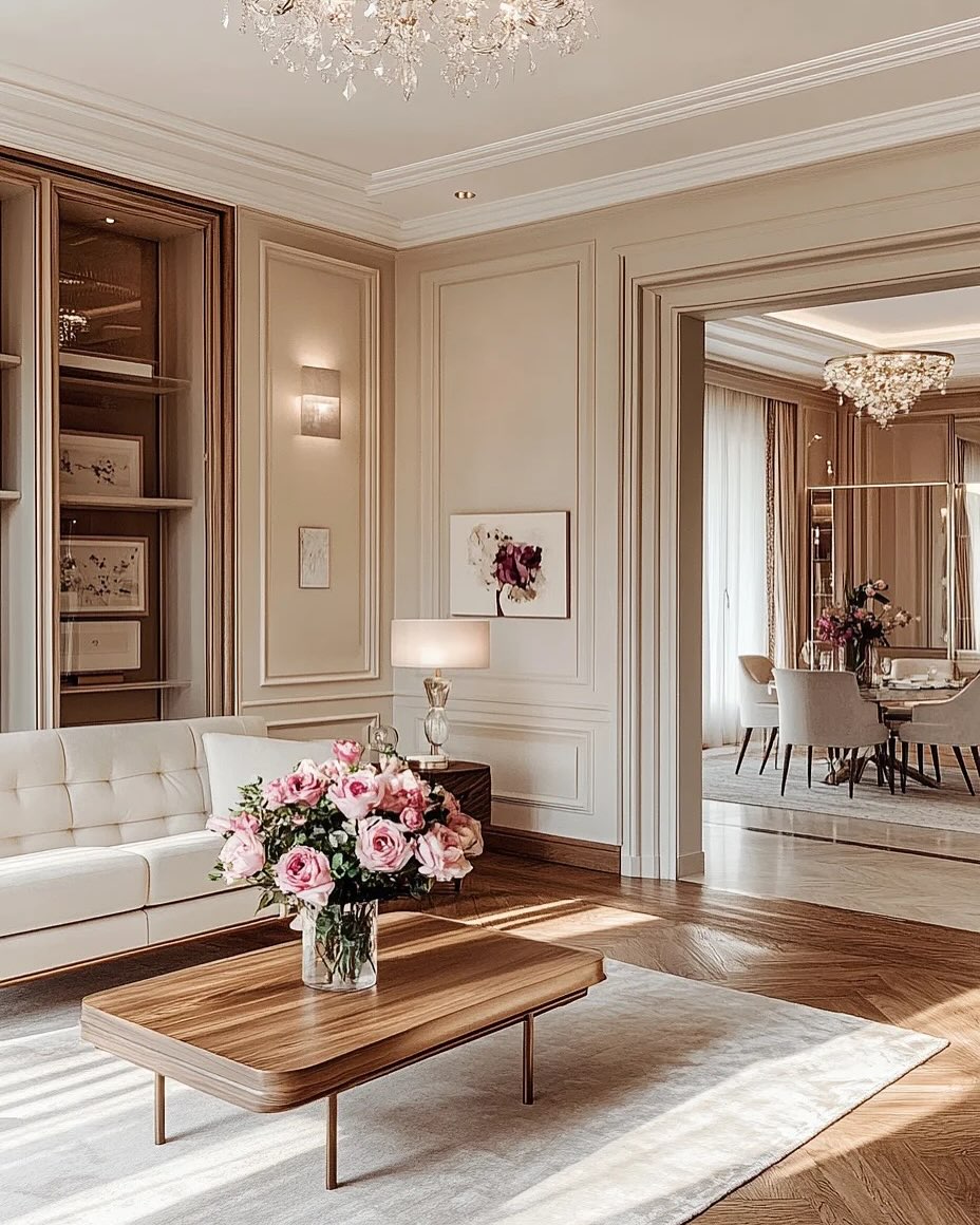
In the world of interior design, there’s an undeniable allure to the simplicity and elegance of a monochromatic color scheme. A home drenched in a single color from top to bottom can feel sleek, sophisticated, and polished. But when it’s taken to the extreme—monochrome-on-monochrome, where different shades of the same color dominate every surface—it can sometimes result in a space that feels sterile, uninspiring, and, well, starving for personality.
While a monochromatic aesthetic can certainly look cohesive, it’s easy to find yourself trapped in a sea of one-dimensional design. Here's why the monochrome-on-monochrome trend can sometimes leave a home feeling flat and lacking character—and how to inject some personality into these spaces.
The Appeal of Monochrome
Before diving into the drawbacks, it’s worth acknowledging why monochrome is so appealing in the first place. A monochromatic palette can bring a sense of harmony and order to a space. With the absence of clashing colors, the focus shifts to textures, shapes, and forms. It’s a minimalist's dream and offers a streamlined, modern feel.
Monochrome also creates a sense of unity, particularly in small spaces, where limiting the color palette can make a room feel more expansive and cohesive. Whether it’s all-white, all-black, or any other single color, this aesthetic can make a statement of its own by letting texture and lighting variations do the heavy lifting.
The Problem with Monochrome-on-Monochrome
However, the problem begins when this minimalist approach is taken too far—especially when the space is saturated with different shades of the same color, creating an overwhelming sense of uniformity. While a monochrome look may be chic on the surface, without the right touches, it can leave a room feeling devoid of life and warmth.
Here are a few ways monochrome-on-monochrome aesthetics can fall flat:
-
Lack of Contrast
When everything in a room is a variation of one color, there’s a risk of the space feeling flat—both visually and emotionally. Contrast plays a crucial role in design by helping to create depth, structure, and focal points. Without enough variation in hues, textures, and patterns, a monochromatic room may fail to engage the eye, leaving it searching for something more stimulating. -
No Visual Focal Point
In interior design, focal points are what draw attention and create interest. A well-placed artwork, a striking piece of furniture, or even a contrasting accent wall can become the centerpiece of a room. But in a monochrome-on-monochrome environment, everything blends into a sea of similarity, making it hard to pick out a feature that stands out. As a result, the space can feel more like a backdrop than a dynamic, engaging room. -
Aesthetic Stagnation
Monochromatic schemes, when not thoughtfully implemented, can easily stagnate. If every piece in the room is composed of the same shade, it can feel as though the room is stuck in a loop of repetition. Without pops of other colors, patterns, or textures, the aesthetic can become one-dimensional, leaving you wondering what the personality of the space truly is. -
Unintentional Coldness
While neutral shades like white, beige, or grey are often associated with elegance and sophistication, an over-reliance on these tones in a monochrome-on-monochrome scheme can leave a room feeling impersonal or cold. These shades, especially in their lighter forms, can make a space feel sterile, like a showroom or a minimalist art gallery—rather than a place that invites people to linger and feel at home.
How to Bring Personality into a Monochrome-on-Monochrome Space
Monochrome-on-monochrome doesn’t have to be a design dead-end. With a few thoughtful additions, you can inject some life, character, and personality into your space, without abandoning the clean elegance of a monochromatic palette. Here’s how:
-
Play with Texture
One of the best ways to break up the monotony of a monochromatic room is through texture. Mixing different materials—like velvet, wood, leather, metal, and wool—can create depth and interest, even if all the pieces are in the same color family. Textures add complexity to a room and allow different elements to stand out, despite using a single hue. -
Introduce Accents and Patterns
While a true monochromatic palette avoids bold color contrasts, you can still introduce variety with patterns and accent elements. Think of a room that’s predominantly soft gray, but has a rug with a subtle geometric print or a throw pillow with a textured pattern. Small splashes of pattern can create a sense of movement and prevent the room from feeling static. -
Highlight Key Design Features
Even in a monochromatic space, there’s room for one or two striking features. Consider introducing a feature wall or statement piece of furniture that’s just a shade off from the rest of the room, or even metallic accents to draw the eye. These subtle shifts in hue or material can become visual focal points that add interest without overwhelming the space. -
Play with Lighting
Lighting can make or break a monochromatic room. Natural light can bring out the richness of a single color, while artificial light can create shadows and highlights that bring dimension to a space. Consider using a combination of lighting styles—ambient, task, and accent lights—to create a balanced atmosphere. Lighting can also help emphasize textures and objects in the room, making them more visually interesting. -
Add Personal Touches
Your personality should shine through in your space. Introduce items that have personal meaning, such as photographs, artwork, or collectibles. Even in a monochrome room, personal touches make the space feel unique to you. If you're using neutral tones, consider incorporating pieces that have meaning to you but still blend in with the palette. -
Introduce Subtle Color Shifts
Monochrome doesn’t mean one exact color. Try introducing a slight gradient effect by using lighter or darker tones of your chosen color. This approach helps keep the monochromatic feel while still creating a layered, engaging look that avoids a sense of uniformity.
Conclusion: Monochrome with Personality
While the monochrome-on-monochrome aesthetic is undeniably chic, it can often result in a space that feels more like a sterile showroom than a lived-in home. However, with a bit of thought and the right mix of textures, lighting, and personal touches, you can easily transform a potentially flat design into one that feels warm, inviting, and full of character.
Monochrome doesn’t have to mean boring—injecting personality into your space is the secret to making any color scheme feel alive and vibrant. So, if you're drawn to the elegance of monochrome, take the time to add the little details that will truly make your space shine.