Neutral Color Schemes: Interior Designers Share Palette Inspiration for Decorating with Muted Shades by SJ Interior Designs
Share
When it comes to creating a timeless, sophisticated home, neutral color schemes are often the go-to choice. Soft, muted shades offer a versatile foundation that can seamlessly integrate into any room, elevating the space without overwhelming it. Whether you’re designing a cozy living room, a tranquil bedroom, or a stylish kitchen, neutrals can create a serene, balanced atmosphere that feels effortlessly elegant.
But neutral doesn’t have to mean boring! At SJ Interior Designs, we believe that neutral color schemes are anything but dull. In fact, muted tones can transform your home into a calming sanctuary when paired thoughtfully with textures, accents, and the right contrast. If you’re looking to refresh your space with a sophisticated neutral palette, here’s how our designers recommend decorating with muted shades, complete with expert tips and palette inspiration.
The Beauty of Neutrals: Why They Work
Neutral color schemes are beloved by interior designers for several reasons. First, they create a sense of calm and space, which makes them perfect for both small and large rooms. Neutrals also allow for greater flexibility, serving as the ideal backdrop for a variety of styles, from minimalist to more eclectic and boho looks. Plus, they offer the opportunity to highlight key design elements like furniture, art, and architectural details.
At SJ Interior Designs, we specialize in bringing the best out of muted shades. The beauty of neutrals is that they never go out of style. They create a timeless environment that will feel fresh and relevant for years to come.
Neutral Color Palette Inspiration
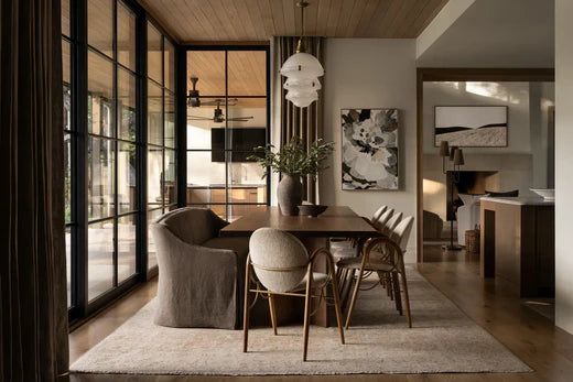
When working with neutral tones, it’s important to understand that not all neutrals are created equal. From warm beige to cool greys, neutral shades encompass a broad range of hues. By mixing and matching various tones, you can create depth, warmth, and contrast in your space. Here are some of our favorite neutral color palettes that work beautifully together:
1. Warm Taupe and Soft Ivory
A warm taupe paired with soft ivory is a classic combination that exudes understated elegance. The taupe acts as a grounding shade, while the ivory lightens up the room and adds a soft glow. This palette is ideal for creating a cozy, inviting living room or bedroom, where comfort is key.
Tip: Mix in natural textures, like a linen sofa, wooden coffee tables, or a jute rug, to enhance the warm and earthy feel.
2. Greys and Charcoal with Accent Whites
For a more modern, industrial look, pairing various shades of grey—ranging from light silver to deep charcoal—with crisp white accents is a chic choice. This palette feels sophisticated and serene, providing a sleek foundation for minimalist or contemporary design.
Tip: Consider matte black fixtures, glass accessories, and abstract artwork in varying shades of grey to add dimension and interest.
3. Creamy Beige and Soft Pastels
For a light, airy vibe, a creamy beige paired with soft pastels like pale pink, lavender, or mint green brings a subtle pop of color without overpowering the space. This combination creates a gentle, warm environment that’s perfect for bedrooms, bathrooms, or nurseries.
Tip: Incorporate textured fabrics like velvet throw pillows or woven throws to introduce some visual intrigue without stepping outside the neutral palette.
4. Greige and Charcoal with Wood Tones
The combination of “greige” (a perfect blend of grey and beige) with rich charcoal tones and natural wood accents creates a harmonious and grounded space. The greige provides a soft, versatile foundation, while the charcoal gives the room some depth and sophistication. Adding wood tones—whether in the form of flooring, furniture, or décor—introduces warmth and texture to the palette.
Tip: Pair with metallic gold or bronze hardware, such as drawer pulls or light fixtures, to add a touch of luxury and contrast.
5. Muted Greens and Taupe
Muted greens, like sage or olive, blend beautifully with taupe tones, creating a soft, nature-inspired palette. These earthy hues bring a sense of tranquility to any room, ideal for creating a relaxed, spa-like atmosphere. It’s a perfect choice for a home office, reading nook, or meditation space.
Tip: Enhance the calming feel with indoor plants, natural stone, and woven textures.
6. Soft Whites and Blush Pinks
Soft whites paired with subtle blush pinks create an elegant yet serene atmosphere. This palette is particularly well-suited for bedrooms or living areas, where the goal is to evoke feelings of peace and tranquility. The blush adds a soft touch of color that’s far from overpowering, offering a sophisticated warmth to the space.
Tip: Incorporate gold or rose gold accents in lighting fixtures, picture frames, or other accessories for an extra touch of luxe.
How to Incorporate Neutrals into Your Home
While choosing the right neutral palette is crucial, how you apply it within your space is just as important. Below are some key design principles that will help you make the most of your neutral color scheme.
1. Layering Textures
Neutral tones can sometimes feel flat without the right textures to add depth and interest. Layer different textures to keep the space dynamic and engaging. Combine soft, plush fabrics like velvet or chenille with natural materials like wood, stone, or metal. For instance, a velvet sofa in warm taupe pairs beautifully with a jute rug, a marble coffee table, and linen curtains.
2. Contrast with Bold Accents
One of the key strategies for working with neutrals is to incorporate contrasting accents. While neutrals provide a calm, cohesive backdrop, bold accents like navy, mustard, or emerald green can add personality and flair. A neutral living room, for example, could be paired with deep blue throw pillows, a gold-framed mirror, or a vibrant piece of artwork to create a balanced yet visually exciting space.
3. Create Balance with Lighting
Lighting is critical when working with neutral tones. Natural light is always best to highlight the subtleties of muted shades, so try to maximize window space with light, airy curtains. If natural light is limited, incorporate layered lighting—ambient, task, and accent lights—to create warmth and highlight key design features.
4. Use Neutrals in Different Rooms
Neutrals are versatile enough to work throughout your home, whether in the living room, bedroom, kitchen, or even the bathroom. In fact, many designers advocate for creating a cohesive flow from one room to the next using similar neutral tones. This allows you to create a seamless transition from space to space while still adding individuality through decor and furnishings.
5. Incorporate Architectural Elements
Neutral tones are particularly effective in highlighting architectural details, such as crown moulding, wainscoting, or exposed brick. By painting these features in subtle shades of white, light grey, or beige, you draw attention to their beauty without competing with the overall design.
Final Thoughts: Timeless Neutral Luxury
Neutrals have long been a go-to choice for creating timeless, calming spaces—and at SJ Interior Designs, we believe they are an essential part of any well-designed home. Whether you’re looking to update your space with a soft, neutral palette or you’re starting from scratch with a new home, the versatility of muted tones offers endless possibilities.
By thoughtfully layering textures, introducing contrasting accents, and ensuring that every piece serves a purpose, neutrals can be anything but boring. In fact, when done right, they can create a home that feels sophisticated, warm, and effortlessly stylish—one that never goes out of fashion.
Are you ready to embrace the beauty of neutrals in your home? Let SJ Interior Designs help you curate the perfect palette that reflects your personal style and enhances the atmosphere of every room