The 10 Benjamin Moore Neutrals Interior Designers Always Reach for — And How They Decorate With Them
Share
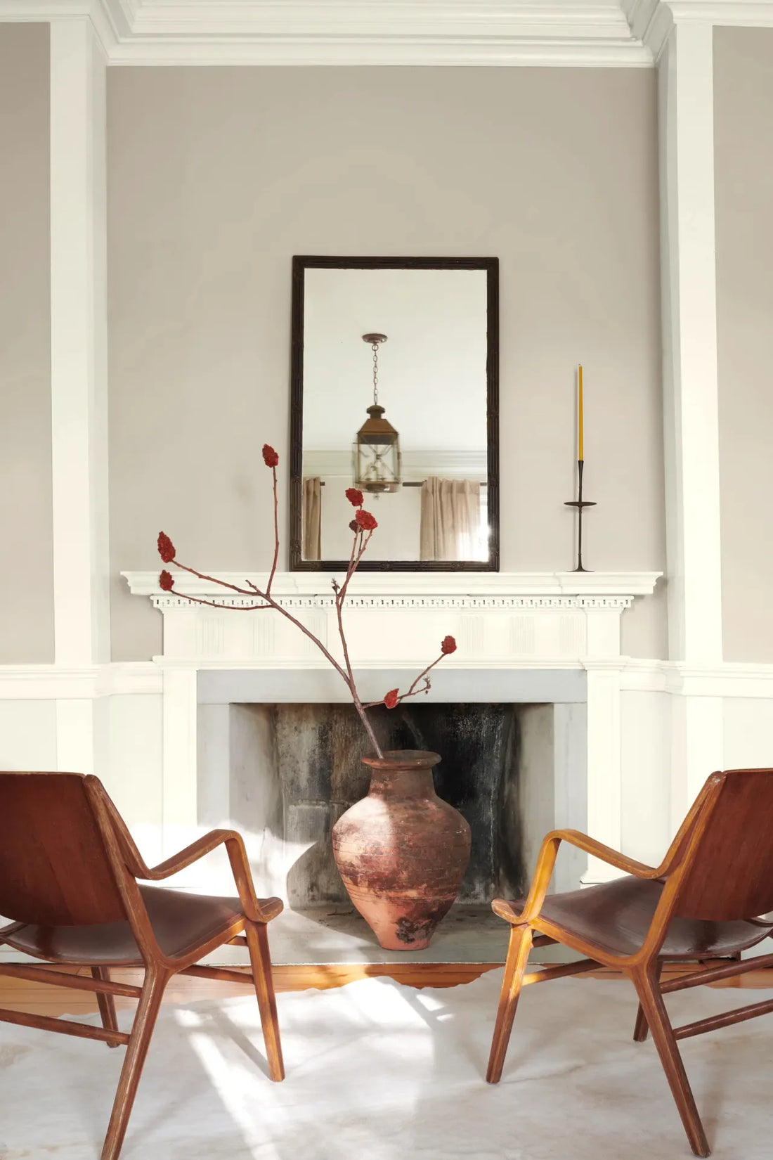
Benjamin Moore is renowned for its vast palette of neutrals, many of which are popular among interior designers for their versatility and timeless elegance. These colours can be used in virtually any space, offering a backdrop that complements both bold statements and subtle design features. Here are 10 Benjamin Moore neutrals that interior designers often reach for, along with suggestions on how they decorate with them:
1. Revere Pewter (HC-172)
- Why Designers Love It: This soft, warm grey with hints of beige is one of Benjamin Moore’s most beloved neutrals. It’s subtle enough to serve as a backdrop but still adds depth to a space.
- How It’s Used: Designers often use Revere Pewter in living rooms, kitchens, and bedrooms. It pairs beautifully with both cool tones (like blues and greens) and warm tones (such as mustard and terracotta), making it incredibly versatile. Designers might also use it in open-plan spaces to create a flow between rooms without overwhelming the senses.
2. Edgecomb Gray (HC-173)
- Why Designers Love It: A lighter, more subdued grey with warm undertones, this colour works well in spaces where a soft, sophisticated look is desired.
- How It’s Used: Edgecomb Gray is often chosen for bedrooms and bathrooms, providing a serene and calm environment. It pairs beautifully with white trim and dark wood accents, as well as softer hues like blush pink and pale blue. It also looks stunning in kitchens when combined with white cabinetry or natural wood elements.
3. Balboa Mist (OC-27)
- Why Designers Love It: This very light, warm grey with a hint of beige is often described as a "perfect" neutral. It's light enough to brighten a room but still offers enough depth to feel cosy.
- How It’s Used: Balboa Mist works wonderfully in both modern and traditional spaces, especially in living rooms, dining rooms, and hallways. Designers might pair it with rich textures like velvet or leather, creating a balanced space that's both chic and comfortable.
4. Gray Owl (OC-52)
- Why Designers Love It: Gray Owl is a soft grey with blue undertones, which makes it look fresh and airy. It’s a very calming shade that’s still vibrant enough to work well in contemporary spaces.
- How It’s Used: Often used in open-concept spaces, Gray Owl is an ideal choice for living rooms, kitchens, and bathrooms. It pairs well with white trim and darker accent colours, like navy or charcoal, and complements natural materials such as wood and stone.
5. Classic Gray (OC-23)
- Why Designers Love It: As its name suggests, Classic Gray is a timeless light grey that doesn’t lean too warm or too cool. It’s incredibly versatile and works with virtually any style or colour palette.
- How It’s Used: Designers often use Classic Gray in spaces that need lightening up, like small rooms or hallways. It's also a popular choice for home offices or libraries, where a neutral but clean backdrop allows for pops of colour in furniture and décor.
6. Shaker Gray (HC-167)
- Why Designers Love It: A slightly darker, more muted grey-blue, Shaker Gray offers sophistication without being overwhelming. It adds depth and character to a room.
- How It’s Used: Shaker Gray is ideal for dining rooms or accent walls, where its understated tone creates a refined atmosphere. It works well with wood tones, such as oak or walnut, and can be paired with accents like brass or gold for a touch of glamour.
7. Sterling (1475)
- Why Designers Love It: This greyish, bluish taupe has a subtle elegance that works in both modern and traditional settings. It’s not too cold, making it a cosy and inviting choice.
- How It’s Used: Sterling is often used in bedrooms or bathrooms, where the calm, muted tone creates a restful environment. It pairs well with both light and dark accents, making it versatile for various types of decor, from rustic to contemporary.
8. Pale Oak (OC-20)
- Why Designers Love It: A soft, warm beige-grey, Pale Oak is a neutral that reads almost like a warmer off-white. It’s light and airy, making rooms feel spacious and welcoming.
- How It’s Used: Pale Oak is often chosen for large spaces such as living rooms, open-plan kitchens, and dining rooms. Designers may pair it with large windows for a light-filled feel, combining it with deep blue or green accents for added warmth and contrast.
9. Sea Haze (2137-50)
- Why Designers Love It: This pale greenish-grey has a subtle beachy vibe, evoking calm and serenity. It's a versatile neutral that can read as either cool or warm depending on surrounding colours.
- How It’s Used: Sea Haze is perfect for coastal or spa-inspired interiors. Designers often use it in bathrooms, bedrooms, or living rooms, pairing it with whitewashed wood or soft wicker furniture to create a soothing atmosphere. It also pairs beautifully with crisp white and soft blues for a tranquil vibe.
10. Muslin (1088)
- Why Designers Love It: Muslin is a warm, light taupe with beige undertones, offering a rich, elegant tone without being too dark or overpowering.
- How It’s Used: This colour is ideal for spaces that need a little warmth, such as living rooms, bedrooms, or even dining areas. It pairs well with natural textures like linen and cotton, and it complements both rich wood tones and metallic finishes.
Conclusion
These Benjamin Moore neutrals offer timeless elegance and flexibility, making them favourites among interior designers. Whether you want to create a calming, minimalist space or add warmth and depth to a room, these colours serve as versatile foundations for various design styles. To make the most of these hues, designers often layer them with textures, contrast them with accent colours, and consider natural lighting to enhance the room’s overall atmosphere