The Power of Colour: Choosing the Right Palette for Your Home
Share
Colour is one of the most influential elements in interior design. It can transform a space, evoke emotions, and set the tone for your entire home. Whether you’re designing a cozy living room, a serene bedroom, or a vibrant kitchen, choosing the right colour palette is crucial for creating a space that feels harmonious and reflects your style.
In this blog, we’ll explore the power of colour in interior design, how different colors can affect the mood of a room, and how to choose the perfect palette for your home.
1. Understanding the Psychological Impact of Colour
Colors have the power to influence our emotions and behaviour. By understanding the psychological impact of different colors, you can choose hues that align with the purpose of each room and the feelings you want to evoke.
-
Warm Colors (Red, Orange, Yellow): These colors are known to be energising and stimulating. They can make a space feel lively and inviting. Red is often associated with passion, while orange represents warmth and enthusiasm. Yellow is bright and uplifting, often evoking happiness and positivity.
-
Cool Colors (Blue, Green, Purple): Cool colors are calming and soothing, making them perfect for bedrooms and spaces meant for relaxation. Blue is often associated with serenity and tranquility, while green evokes a sense of nature and balance. Purple can create a sense of luxury and creativity.
-
Neutrals (Gray, White, Black, Beige): Neutrals are timeless and versatile, making them ideal for creating a sophisticated and balanced atmosphere. Gray can be both soothing and modern, while white is clean and pure, and black adds depth and elegance. Beige is warm and neutral, offering a subtle, sophisticated backdrop.
2. How to Choose a Colour Palette for Your Home
Selecting a colour palette can be overwhelming, especially with so many shades to choose from. However, with the right approach, you can curate a palette that enhances your space and reflects your personality.
-
Start with a Focal Point: Whether it’s a piece of artwork, a rug, or a statement piece of furniture, start with a focal point that you love and build your color scheme around it. This could be a piece of furniture in a bold color or an artwork that incorporates multiple hues.
-
Consider the Room’s Function: Think about how you want the room to feel. For example:
- Living Room: If your living room is a gathering space, choose a palette that fosters warmth and comfort. Warm neutrals paired with accents of rich tones (like mustard yellow or deep blue) create a welcoming atmosphere.
- Bedroom: For a peaceful retreat, opt for calming tones like soft blues, greens, or lavender. These colors promote relaxation and restful sleep.
- Kitchen: Energising tones like vibrant yellows or soft greens can invigorate a kitchen, while neutrals with pops of color can create a modern and clean feel.
-
Balance Bold and Neutral Tones: A good rule of thumb is to choose one or two primary colors and balance them with neutrals. If you’re using a bold color for an accent wall, pair it with neutral shades for furniture and decor to avoid overwhelming the space.
-
Create Contrast and Depth: Incorporate contrasting colors to add visual interest and depth. For example, pairing a deep navy blue with white accents or adding gold elements to a black and gray room can create a striking and dynamic look.
3. Popular Colour Palettes for 2025
As we move into 2025, certain colour trends are emerging that bring sophistication, serenity, and freshness to modern homes. Here are some of the most popular color palettes to consider for your home:
-
Earthy Tones and Terracotta: Earthy hues like terracotta, rust, and mustard yellow are making a comeback. These warm, natural tones bring a grounded, rustic vibe to interiors and work beautifully in living rooms, kitchens, and even bathrooms.
-
Soft Neutrals with Bold Accents: Soft neutrals like beige, taupe, and off-white are timeless and can be enhanced with bold accent colors such as emerald green, deep navy, or rich burgundy. This palette creates a sophisticated, balanced environment.
-
Pastels with a Modern Twist: Soft pastels like dusty pink, mint green, and pale lavender are becoming increasingly popular. These gentle hues are perfect for creating a calming atmosphere in bedrooms, bathrooms, or even home offices. Pair pastels with sleek, modern furniture or metallic finishes for an updated, fresh look.
-
Blues and Greens for Serenity: Shades of blue and green continue to dominate interior design trends in 2025, providing calmness and tranquility to spaces. Lush greens, like sage or forest green, are great for bringing a sense of nature indoors, while soft blue tones add a serene and peaceful vibe.
-
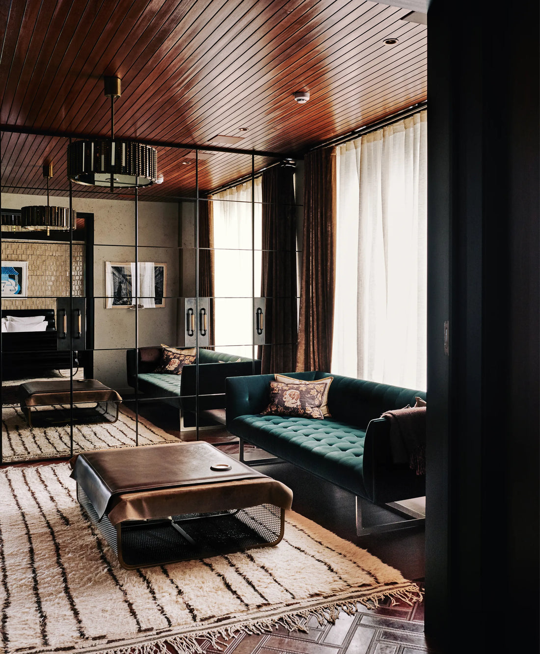
Moody and Dark Tones: Deep, moody tones like charcoal gray, midnight blue, and forest green are trending in 2025. These colors add drama and sophistication to a room, especially when paired with luxe finishes like gold or brass accents.
4. How to Combine Colors Effectively
Once you’ve decided on your base color palette, it’s important to know how to combine your colors effectively. A few key principles can help you make the most of your colour choices:
-
The 60-30-10 Rule: This rule suggests using 60% of your dominant color, 30% of a secondary color, and 10% of an accent color. For example, in a living room, you might have 60% neutral tones (like beige or gray), 30% accent colors (like navy blue or mustard), and 10% of a contrasting accent (like gold or emerald green).
-
Use Colour Blocking: Colour blocking is a modern design technique where you use bold, contrasting colors in different sections of a room. For example, a kitchen could have a navy blue island with soft grey cabinetry, creating a striking visual effect.
-
Consider Texture and Finish: The way a colour looks can change depending on the texture and finish of the material. Matte finishes are soft and subdued, while high-gloss finishes reflect light and make colors appear brighter. Be sure to take texture and sheen into account when choosing your colors.
5. Experiment with Accent Walls and Features
If you’re hesitant to commit to an entire room in a bold colour, consider creating an accent wall. Accent walls can add personality and depth to a space without overwhelming the entire room. Some popular options for accent walls in 2025 include:
- Bold Colors: Use vibrant hues like teal, mustard, or emerald green on one wall to create a striking focal point.
- Textured Wall Treatments: Experiment with textured wallpapers, wood paneling, or exposed brick on one wall to create depth and visual interest.
- Gallery Walls: If you love art, a gallery wall filled with personal pieces can also serve as a feature wall that adds color, style, and a personal touch.
6. Avoid Common Colour Mistakes
Choosing the right colour for your home can be tricky, and many people make a few common mistakes when selecting a palette. Here are some things to avoid:
- Overuse of Bold Colors: While bold colors can be exciting, using them in excess can overwhelm a space. Always balance bold hues with neutrals or muted tones to create a harmonious feel.
- Underestimating Lighting: The way light interacts with a colour can significantly impact how it looks. Colors may appear darker or lighter depending on the natural and artificial light in the room. Test paint colors on your walls before committing to see how they look in different lighting conditions.
- Ignoring Flow Between Rooms: When selecting colors for different rooms, it’s essential to maintain some continuity so the spaces flow naturally. Try to create a cohesive colour scheme across rooms, using shades that complement one another.
The Power of Color in Interior Design
Colour is a powerful tool in home design, capable of transforming your space and enhancing your overall living experience. By understanding the psychological impact of different colors, following the latest trends, and combining colors effectively, you can create a home that feels both beautiful and functional. Whether you're aiming for a soothing retreat or a vibrant, energizing space, the right color palette can make all the difference.
At SJ Interior Designs, we specialize in helping clients choose the perfect color palettes that reflect their unique style while creating an atmosphere of elegance and comfort. Contact us today to start designing your dream home with the power of color!