Unexpected Magic: Colour Combinations That Shouldn’t Work, But Do
Share
When it comes to interior design, certain colour pairings are often labeled as “don’ts” by traditionalists. Yet, some combinations—though seemingly contradictory—create striking, dynamic spaces that defy expectations. Here, we explore some unconventional colour duos that might seem incompatible at first glance but, when executed well, can transform your space with unexpected charm.
The Art of Contrasting Colours
Mixing bold hues can add energy and personality to a room. The secret lies in balance, texture, and careful proportion. By pairing contrasting colours, you can highlight architectural features, create focal points, and evoke strong emotions.
Key tips for success:
- Balance with Neutrals: If a colour pairing feels too intense, grounding the scheme with neutrals like white, grey, or beige can create a harmonious balance.
- Varying Textures: Incorporate different textures through fabrics, wall finishes, and accessories to add depth and soften the impact of clashing colours.
- Accent Pieces: Use one of the colours as an accent rather than the dominant hue. This approach prevents visual overload while still delivering the desired pop.
Bold Combinations That Defy Convention
1. Navy and Mustard
At first glance, deep navy and vibrant mustard might seem like an unlikely duo. However, when combined, they evoke a sense of timeless sophistication with a modern twist.
-
Why it works:
The rich depth of navy provides a serene backdrop, while mustard injects warmth and energy. This pairing works exceptionally well in living rooms and dining areas where you want to create a cozy yet upscale atmosphere.
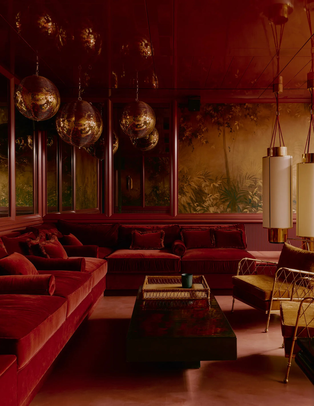
2. Blush Pink and Burgundy
Pairing soft blush pink with the intensity of burgundy creates an intriguing interplay of light and dark.
-
Why it works:
The delicate nature of blush softens the dramatic impact of burgundy, making the combination feel balanced and elegant. This duo is perfect for bedrooms or intimate spaces, where a subtle play on contrasts can evoke romance and sophistication.
3. Teal and Orange
Teal’s cool, calming vibe juxtaposed with the energetic burst of orange is a daring yet successful strategy in modern design.
-
Why it works:
The complementary nature of these colours—one cool, one warm—creates a dynamic contrast that energizes the space without overwhelming it. Use teal as the base and let orange serve as accent pieces through art or décor to achieve the right equilibrium.
4. Purple and Yellow
Long considered opposites on the colour wheel, purple and yellow can create an electrifying yet balanced environment when used thoughtfully.
-
Why it works:
Purple’s deep, reflective qualities are brightened by the sunny disposition of yellow. This combination is ideal for creative spaces or children’s rooms where vibrancy and playfulness are encouraged.
5. Green and Pink
The unexpected marriage of green and pink can lend a garden-inspired, whimsical touch to your interiors.
-
Why it works:
While green symbolizes nature and growth, pink brings a sense of playfulness and softness. Together, they can create a refreshing, modern look perfect for spaces that need a touch of natural elegance with a contemporary twist.
How to Experiment with Unconventional Colour Pairings
Start Small:
Begin with smaller elements like cushions, throws, or accent walls before committing to larger installations. This approach lets you test the combination and adjust as needed.
Create Mood Boards:
Digital or physical mood boards can help you visualize how these colours interact. Collect fabric samples, paint swatches, and photos to see the overall effect before making any final decisions.
Layer and Gradate:
Consider using a gradient of shades from each colour. For instance, a transition from light blush to deeper burgundy can create a smoother visual flow rather than a stark, hard contrast.
Seek Inspiration:
Look at contemporary design magazines, blogs, or social media platforms like Pinterest and Instagram to see how other designers have successfully employed these daring pairings.
Final Thoughts
Colour is a powerful tool that can set the tone for an entire room. While some pairings might seem off-putting at first, with thoughtful application and design strategy, these unexpected duos can lead to truly captivating spaces. Embrace the challenge, experiment boldly, and you might just discover that what once seemed impossible can become your signature style.
Ready to break the mould? Explore these unconventional combinations and bring a burst of unexpected magic to your interiors.